Van Life & Everyday Touring
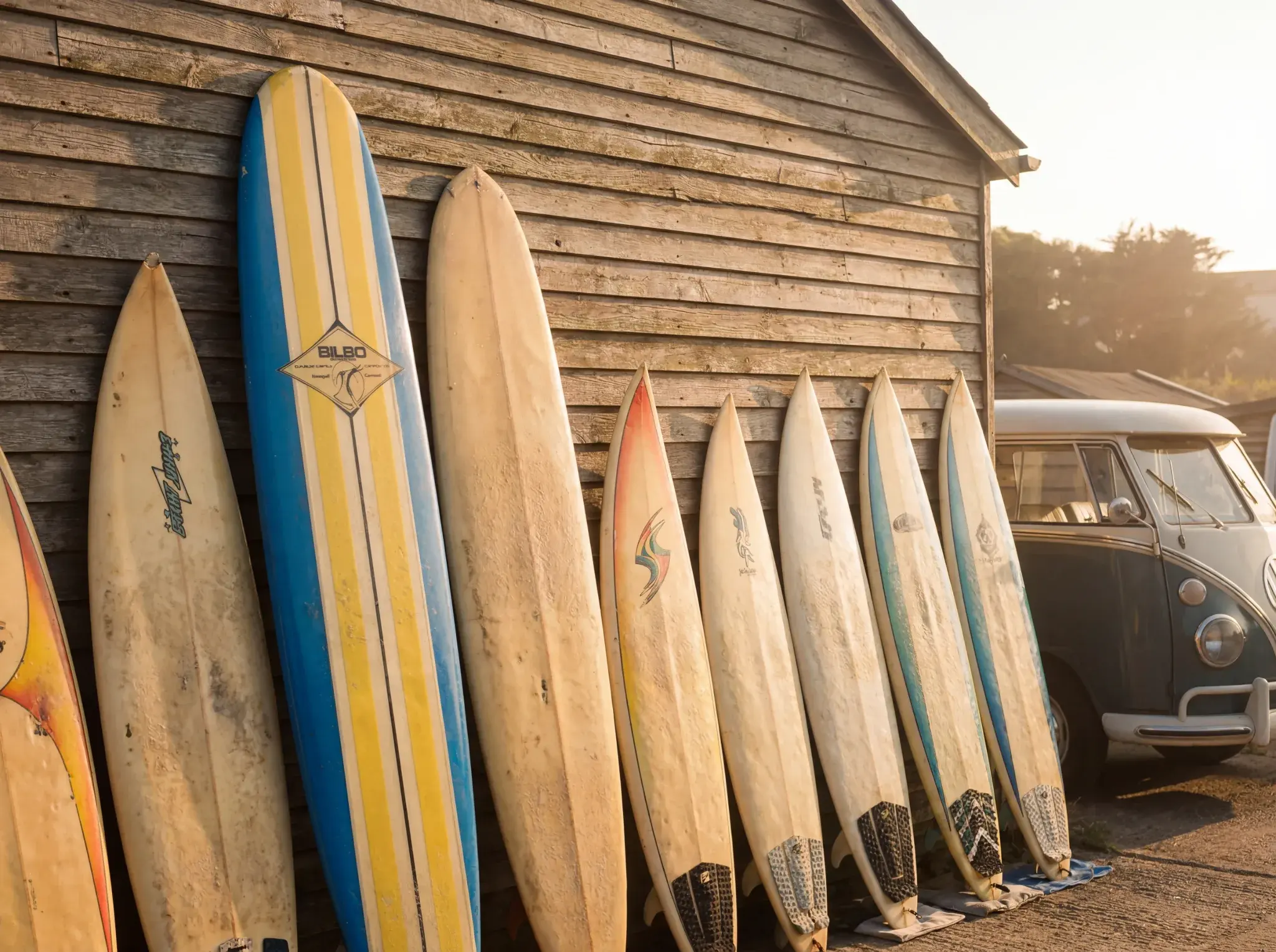
Do you remember these vintage surf brands and their logos?
Written by
Rowan
Rowan writes editorial features, comparisons, and industry context pieces that help readers understand the campervan and motorhome landscape.
The short answer
Surfing produced some of the most evocative graphic design of the twentieth century, and there is a lovely reason why: the brands were started by surfers in garages and the backs of vans, drawing their own logos because they could not afford to pay anyone else. The American originals invented the kit, O'Neill (1952) and Body Glove (1953) the wetsuit, Hang Ten (1960) the bare-feet logo and early boardshorts, Hobie (1954) the foam board. The Australian giants Quiksilver and Rip Curl both began in Torquay in 1969, and Quiksilver's mountain-and-wave became a global icon, while Stüssy grew from a shaper's signature into a streetwear giant. It is a wonderful slice of design history. Here are the logos that defined surfing, and the stories behind them.
There's a particular kind of nostalgia that lives in a surf logo. Two little bare feet. A wave curling over a mountain. A single jagged lightning bolt in red and yellow. For anyone who grew up anywhere near a beach, or just wanted to look like they did, these marks are time machines, and a faded sticker on the back window of an old van can take you straight back to a summer you half-remember.
Surfing produced some of the most evocative graphic design of the twentieth century, partly because the brands were started by surfers in garages and the back of vans, drawing their own logos because they couldn't afford anyone else to. So this is a fond, slightly indulgent tour through the great vintage and original surf brands and the logos that defined them, the American originals who invented the wetsuit and the boardshort, the Australian and Hawaiian names that ruled the seventies and eighties, and the British brands that kept us warm in the cold Atlantic. A couple of the origin stories are more legend than documented fact, and where that's the case we'll say so, because the real histories are good enough without the polish. We've grouped them roughly by era, from the Californian originals who invented the kit, through the Australian and Hawaiian giants who ruled the seventies and eighties, to the British brands that kept us surfing through the cold, and we've flagged the most iconic logos and the surprising number of these names that have risen from the dead. Grab a brew. This one's for the nostalgics.
The logos that defined surfing
Before we go era by era, a quick roll-call of the marks that even non-surfers recognise, because a handful of surf logos transcended the sport entirely.
The single most iconic is almost certainly the Quiksilver mountain-and-wave, that stylised wave curling over a snow-capped peak, lifted from Hokusai's famous woodblock print The Great Wave off Kanagawa. The Hang Ten two bare feet are the original surf-apparel mark, instantly readable as the noseriding move they're named after. O'Neill's breaking wave comes paired with the best slogan in surfing, "It's always summer on the inside." The Lightning Bolt, a simple red-and-yellow jag, is the connoisseur's favourite, the symbol of seventies Pipeline cool. Stüssy's scrawled signature became one of the most powerful logos in all of fashion, not just surf. And Body Glove's yellow hand and Town & Country's yin-yang are pure, instantly legible seventies and eighties graphic design. Keep those in mind as touchstones; now let's go back to where it all began.
The originals (1950s and 60s): wetsuits, trunks and bare feet
This is the foundational generation, the people who literally invented the wetsuit and the boardshort, often sewing the first ones at a kitchen table or in the back of a van. The logos are simple, hand-made marks, and the nostalgia here is all about authenticity and invention.
Hobie is where the modern surfboard industry begins. Hobart "Hobie" Alter started shaping balsa boards in his father's Laguna Beach garage and opened Hobie Surfboards in Dana Point, California, in 1954. In 1958, with Gordon "Grubby" Clark, he cracked the polyurethane foam blank that would change board-building forever, and after the film Gidget detonated demand he was soon turning out boards by the thousand. The classic cursive "Hobie" script is the mark, and the company, like its later Hobie Cat catamarans, is still very much going.
O'Neill is the wetsuit brand, and for British cold-water surfers it might be the most important name on this whole list. Jack O'Neill started in a garage near Ocean Beach, San Francisco, in 1952, and moved to Santa Cruz later that decade. He didn't single-handedly invent the neoprene wetsuit, the physicist Hugh Bradner has the better claim to that, but O'Neill commercialised it for surfers and made cold water surfable. The logo is a stylised breaking wave, and the slogan, "It's always summer on the inside," is rightly famous. Still a global force, still synonymous with wetsuits.
Body Glove came out of the Dive N' Surf shop in Redondo Beach, California, in 1953, founded by twin brothers Bill and Bob Meistrell. They insulated against cold California water with neoprene and coined the phrase "fits like a glove," which became the name. Their logo, a bright yellow circle containing a simple line drawing of a hand, is one of the most recognised marks in all of watersports, and they've recently leaned back into the old-school version. A friendly note on history: both Body Glove and O'Neill claim a version of "the first practical wetsuit," so treat that particular boast as a long-running rivalry rather than a settled fact.
Gordon & Smith, universally known as G&S, started in a Pacific Beach garage in San Diego in 1959, founded by chemistry-minded Larry Gordon and shaper Floyd Smith. The interlocked G&S logo was designed in 1961 and is still in use, and Smith silk-screened it free onto local surfers' T-shirts, an early piece of guerrilla branding. G&S became a giant in skateboarding too, and its skate decks are now collector gold.
Hang Ten gave surfing its first proper apparel brand and one of its most enduring logos. Founded in Seal Beach, California, in 1960 by Duke Boyd and seamstress Doris Moore, it's often credited with the first commercial surf boardshorts. The logo, the two little embroidered bare feet, stands literally for "hang ten," the noseriding move where all ten toes hang over the nose of the board. Boyd said he painted them in sunset colours; whatever the precise intent, the feet are pure 1960s surf. The brand today is fragmented across licensing deals and huge in Asia, but those feet are immortal.
It's worth pausing on what this first generation actually achieved, because it's easy to take for granted. Before them, there was no such thing as surf-specific clothing or a wetsuit you'd want to wear; surfers froze in woollen jumpers and surfed in whatever shorts they had. Within a single decade, this handful of Californian garages invented the neoprene wetsuit that made cold-water surfing possible anywhere on earth, the durable boardshort that every surf brand since has copied, and the very idea that a surfer might want to dress like one on land. Every brand later in this list, the Australians, the Hawaiians, the British, built on foundations these people laid. The logos are charmingly simple, a wave, a hand, two feet, because branding barely existed as a discipline; they were drawn by founders who were surfers first and businesspeople by accident. That amateur, hand-made quality is precisely why they've aged into icons rather than dated like corporate logos do.
Birdwell Beach Britches is the cult durability brand, founded in Santa Ana, California, in 1961 by Carrie Birdwell Mann, a surf mum who sewed the first pairs in her living room from tough, boat-sail-inspired fabric. The motto, "Quality is our Gimmick," says it all, and the logo evolved into "Birdie," a little anthropomorphic surfboard wearing a pair of Birdwell trunks. Still made in the USA, still a heritage darling.
Katin, or Kanvas by Katin, has one of the best origin stories. Nancy and Walter Katin made canvas boat covers in Surfside, California, when the surfer Corky Carroll complained he couldn't find durable trunks. Walter ran up a pair from heavy boat canvas, and "Kanvas by Katin" was born. Nancy became known as the First Lady of Surfing, and the Katin Team Challenge at Huntington Pier, running since 1977, is an institution. Still trading as a revived heritage brand.
A few more names from this founding era deserve a mention. Surf Line Hawaii and its Jams line popularised the loud, baggy printed shorts that became a craze; Da Kine, founded later in Hawaii, became the go-to for leashes, pads and travel bags, its name simply Hawaiian pidgin for "the thing." And it's worth remembering that in these years the line between board-builder and brand was blurry: Hobie, Gordon & Smith, Bing, Weber and Dewey Weber were as much about the boards as the badges, and the surfboard itself, with the shaper's logo laminated under the glass, was the original surf brand statement. The apparel and wetsuit logos that followed were, in a sense, just a way of wearing your allegiance when you were out of the water. There's a through-line here worth holding onto: almost every one of these brands was started by an actual surfer solving an actual problem, a colder sea, flimsy trunks, a board that didn't exist yet, rather than by a marketing department. It's why the early logos feel so unpretentious, and why they've lasted.
The golden age of the surf logo (the 1970s)
If the fifties and sixties invented the products, the seventies invented the surf brand, the logo as identity. This is the tightest cluster of all-time-great marks, and the moment surfing's graphic language was set.
Quiksilver is the big one. Founded in Torquay, Victoria, Australia, in 1969 by Alan Green and surfing champion John Law, it started with a clever boardshort and grew into a global empire. The logo is the masterpiece: a stylised wave curling over a mountain, drawn from Hokusai's Great Wave, with the wave standing for surfing and the mountain for the snow the Torquay crew had started skiing on. A fact worth getting right, because sources muddle it: Green conceived the mark around 1969 to 1970, originally white on a bright red background, and it was refined and recoloured to its classic black form by about 1973. Bob McKnight and Jeff Hakman took it to America in 1976, and the women's line Roxy followed in 1990. It remains, for most people, the definitive surf logo.
The American chapter is a story in itself: McKnight and Hakman secured the US licence in 1976, with Hakman, as surf legend has it, sealing the deal over a champagne-soaked dinner by eating a paper napkin to prove how badly he wanted it. From that improbable start grew a company that, at its peak, was a billion-dollar global giant, took the brand onto high streets worldwide, and spun off Roxy for women in 1990. It went through bankruptcy and restructuring in the 2010s, a reminder that even the mightiest surf brands ride cycles, but the mountain-and-wave endures on millions of stickers, hoodies and the back windows of vans the world over.
Rip Curl was founded in the same town, Torquay, in the same year, 1969, by Doug "Claw" Warbrick and Brian "Sing Ding" Singer, and there's a lovely interconnection here: the man who helped start Rip Curl's wetsuit side was Alan Green, who promptly left to found Quiksilver. The name came from the words "Rip Curl" written on a board Warbrick had bought, which "didn't mean anything" but sounded groovy. The corporate mark is the wordmark, but the legendary identity is "The Search," the soul-surf concept launched in 1992 with surfer Tom Curren and filmmaker Sonny Miller, which rejected eighties excess and became one of surfing's most beloved campaigns. "The Search" was more than an ad slogan; it was a whole philosophy, the idea that the point of surfing wasn't contests and sponsorship but the endless quest for the perfect, uncrowded wave somewhere over the horizon. It tapped exactly the restless, romantic itch that also sells campervans, and it arrived as a deliberate rebuke to the cash-and-neon excess of the late eighties. For a generation of surfers it defined what the sport was supposed to feel like, and it's no accident the imagery so often featured a van, a dirt track and an empty point break at dawn.
Billabong completed the Australian big three, founded on the Gold Coast in 1973 by Gordon and Rena Merchant, whose triple-stitched boardshorts were famously hard to destroy. "Billabong" is a Wiradjuri word for a waterhole that fills in the rainy season, an Australian oasis, and the logo pairs the word with two stylised waves in a rectangle, said to represent the sea and the sport of surfing. It survived a near-collapse in the 2010s and trades on. Billabong's near-death and survival is a microcosm of the whole industry's recent history: founded by surfers, grown into a global giant, floated on the stock market, expanded too far, and then brought low when the surf-fashion bubble deflated, before being absorbed into a larger group. That it's still here, still on boardshorts and stickers, is a small victory for one of the names that genuinely earned its place.
Lightning Bolt is the purest "you had to be there" logo of the decade. Founded in Hawaii in 1971 by the legendary Gerry Lopez, "Mr Pipeline," and Jack Shipley, it was a shaping collective whose boards were ridden by virtually every top surfer at Pipeline through the mid-seventies. The logo, that simple jagged bolt, was designed by Lopez himself, who says it was "the result of me doodling while talking on the telephone," meant to symbolise energy. For a few golden years it was in every surf film and magazine going, and it's enjoyed a strong revival, especially in Europe. The Lightning Bolt is the surf logo that surfers themselves rate most highly, precisely because it was never really a clothing brand first; it was a board label, ridden by the best surfers in the world at the heaviest wave in the world, and the cool was earned in the water before it was ever printed on a T-shirt. That's the opposite of the mainstream-dilution trap, and it's why the bolt has aged into something closer to a sacred symbol than a corporate mark. Wear one and you're quietly signalling that you know your Pipeline from your point break.
Town & Country, or T&C Surf Designs, was founded on Oahu, Hawaii, in 1971 by Craig Sugihara, in a shop that sat between the island's two surf worlds, hence "Town & Country." Its unmistakable yin-yang logo stands for balance, fitting for surfing. Bonus nostalgia for a certain generation: T&C's cartoon characters, "Da Boys," got their own 1988 Nintendo game, T&C Surf Designs, a deep-cut memory for retro gamers.
Ocean Pacific, or OP, defined the late-seventies and eighties casual look. The apparel brand launched in 1972, though the OP name had existed on surfboards in the sixties, and its mid-wale corduroy walkshorts went mainstream far beyond surfing. The OP mark, often rendered in sunset rainbow stripes, is pure beach Americana, and the first OP Pro at Huntington Beach in 1982 drew tens of thousands.
Two more seventies names worth a nod: Piping Hot, founded in Torquay, Australia, in 1975, with its flame motif, now a Target Australia staple; and Local Motion, the home-grown Hawaiian label founded in 1977 by Rob Burns, with its iconic palm-tree logo.
The neon era (the 1980s): fluoro, sharks and attitude
The loudest, most nostalgia-drenched era of all, and the moment surf design gave birth to streetwear. Neon clamdiggers, cartoon shark mascots, and slogans designed to wind you up.
Stüssy is the surf brand that conquered the world. Founded in Laguna Beach, California, in 1980 by surfboard shaper Shawn Stussy, who screened T-shirts at night to sell in surf shops, its logo is the hand-scrawled "Stüssy" signature, drawn with a broad-tipped marker and derived, literally, from the signature of his uncle, the artist Jan Stussy. That scrawl, and the interlocking double-S chain-link mark, became cornerstones of global streetwear, and Stüssy is arguably cooler now than it has ever been.
Gotcha was the neon aggressor, founded in Laguna Beach in 1978 by South African pro surfer Michael Tomson and Joel Cooper. It put bright fluoro on the beach when everyone else wore earth tones, and its original logo was designed by none other than Shawn Stüssy before his own brand took off. The signature mark is a half-man, half-shark waving a flag, and the slogan, "If You Don't Surf, Don't Start," was pure eighties confrontation. By 1987 Gotcha trailed only OP and Hobie in US sales, and it's since been revived, including a high-profile collaboration with streetwear label Brain Dead.
Maui and Sons is peak eighties-into-nineties nostalgia, founded in Malibu in 1980 by three surfers who'd previously run a failed cookie company, a detail that explains the "Cookie" logo, a chocolate-chip-cookie roundel defiantly placed on the back pocket. Add the sunglasses-wearing "Sharkman" mascot and you have a definitive mascot of the era. Still trading on licensing and collaborations.
Instinct is the big eighties brand most people have forgotten, founded in Durban, South Africa, in 1979 by 1977 world champion Shaun Tomson, cousin of Gotcha's Michael Tomson. In the mid-eighties it was the third-largest surf brand in the US behind Quiksilver and Gotcha, and its logo, a surfer inside the tube, came from a 1972 photo of teenage Shaun at Durban's Dairy Beach. Tomson has relaunched it as a heritage brand.
Vans isn't strictly a surf brand, but it's the great surf-and-skate crossover and belongs here. Founded as the Van Doren Rubber Company in Anaheim, California, in 1966, its grippy deck shoes were adopted by surfers and skaters alike. The logos are a family: the "Off The Wall" mark, created around 1976 and designed by thirteen-year-old Mark Van Doren as a skateboard stencil; the random "Jazz Stripe" sidestripe doodled by Paul Van Doren; and the checkerboard pattern that kids started colouring on themselves. Still global, still the original crossover.
The eighties are also where surf branding quietly conquered fashion, a shift you can trace right through to today. The neon shorts and shark mascots look dated now, but the deeper idea, that a surf logo signified a whole attitude and lifestyle you could buy into without ever paddling out, is exactly the idea that streetwear ran with. Stüssy is the obvious bridge, but Gotcha, OP and the rest all helped establish that a small graphic on a T-shirt could carry an entire identity. Modern streetwear's logo obsession owes more to a few eighties surfers with marker pens than it usually admits, and the surf brands themselves learned, sometimes painfully, that selling a lifestyle to people far from the beach was where the real money was, even as it diluted the thing that made them cool in the first place.
The British surf brands: the home heroes
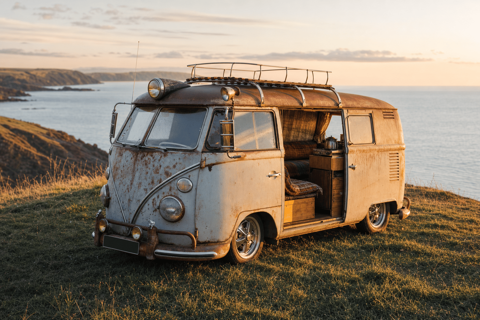
Now the names that matter most to a British audience, and the ones with the strongest van-life connection of all, because British surf culture and the campervan grew up together on the same cold Atlantic beaches.
Gul is the British cold-water pioneer, and its origin story is van-life gold. Founded by Dennis Cross, with sources placing it in Lostwithiel around 1965 or formally in Newquay around 1967, Gul made the UK's first purpose-built surfing wetsuits. As the story is fondly told, the very first Gul suits were stitched in the back of Dennis Cross's split-screen VW camper at Fistral Beach, Newquay, which is about as perfect a piece of British surf-and-van folklore as exists; treat the camper detail as cherished legend rather than hard fact. By the early seventies Gul had created the one-piece "Steamer," named for the steam that rises off a wetsuit when you peel it off on a cold day. And the name itself is a deliberate misspelling of "gull," the seabird. Gul is still the UK's biggest watersports apparel name.
The Gul story is worth dwelling on for a van-life audience because it's so emblematic. A surfer, too cold to enjoy his own coast, solves the problem himself, builds a product in the back of his camper at the beach, and accidentally founds an industry, all without really leaving the car park at Fistral. That's the British surf-and-van dream in miniature: the van as workshop, home and ticket to the waves all at once. It's the same spirit that had the Saltrock brothers screen-printing shirts out of an Austin Allegro twenty years later, and it runs right through British surf culture to this day.
Tiki is the Braunton institution, a surf shop and one of Europe's largest surfboard manufacturers, established in North Devon in 1969 by big-wave surfer and shaper Tim Heyland. Its carved tiki-mask logo ties straight back to the South Pacific romance of surfing's origins, and it's still a fixture of the North Devon scene.
Saltrock is North Devon's neon-era survivor, and another brand with a vehicle at the heart of its story. Founded in 1988 by South African brothers Angus and Ross Thomson, who hand-screened T-shirts and sold them out of the back of their Austin Allegro until demand pulled them off the waves and into business. Named after the town of Salt Rock near Durban, its mascot, "Tok," a wild-haired surfer boy, takes his name from the Tokoloshe, a mischievous water-sprite of South African legend. Now a major British surf-lifestyle high-street name.
Animal is the watch-strap brand that became a high-street staple, founded in Poole, Dorset, in 1987 by Ian Elliot and Nigel Broughton. The original idea was an unbreakable hook-and-loop watch strap, conceived while getting worked by waves off South Africa; the durable fluoro straps caught on and the clothing brand grew from there. After ceasing trading in 2020, the brand was acquired and relaunched by Mountain Warehouse, so it lives on for the millennials who grew up in it.
And then the cold-water moderns, the brands that built a distinctly British identity around surfing grey, freezing Atlantic and North Sea waves. C-Skins, founded in Cornwall in 1997 by Carey Brown, carries a beautiful piece of lineage: Brown learned the craft from his uncle, Dennis Cross of Gul, so there's a direct family line from the very first British wetsuits to one of the best modern cold-water ones. Finisterre, founded in St Agnes, Cornwall, in 2003 by Tom Kay, set out to make kit for cold-water UK surfers rather than the warm Pacific, and took its name from a sea area of the Shipping Forecast, the radio litany every Briton half-knows. And Northcore, founded on the East Coast around 2006, builds accessories for the cold, wild North Sea, starting with the world's first surfer's key safe. Sustainable, hardy and unmistakably British, these are the brands of the modern cold-water identity.
What unites the British names, old and new, is that they were all answers to the same problem: how to enjoy a sport invented in warm Hawaiian water on a coast where the sea rarely troubles fifteen degrees. That constraint bred a distinct, understated, hard-wearing British surf aesthetic, less neon and shark-mascot, more muted, practical and quietly proud, and an entire industry of wetsuits, boots, gloves and changing robes the Californians never needed. It's no coincidence that this cold-water identity grew up alongside British surf-van culture, because if you're going to surf a freezing Atlantic beach in February you want somewhere warm and dry to change and a kettle waiting. How that whole British scene came to be, from Victorian bellyboarders to the Australians who brought foam boards to Cornwall, is a story we tell in full in our history of British surfing.
The great revival: the ones that came back
Part of the joy of surf nostalgia right now is that so many of these names have literally returned. The eighties neon cluster has been resurrected almost wholesale: Gotcha is back, complete with that Brain Dead collaboration; Maui and Sons trades on its Sharkman-and-cookie nostalgia; Instinct has been relaunched by Shaun Tomson himself; and Lightning Bolt has found a whole new life, particularly in Europe. Animal died and was reborn under new ownership. Meanwhile Stüssy and Vans, the two crossover brands, never went away at all, they just kept getting cooler. If you grew up with any of these on your back, the good news is you can mostly buy them again, which is either heartwarming or a sign you're getting old, depending on your mood.
There's a real reason the revivals have worked, beyond simple nostalgia. The original logos were designed in an era of bold, simple, instantly readable marks, exactly the qualities that cut through on a phone screen and a social feed today, so they look, if anything, more modern now than the fussy corporate logos of the 2000s. They also carry an authenticity new brands can't manufacture: a Lightning Bolt or a Gotcha sticker says you know your surf history, and that heritage is worth money in a crowded market. Streetwear's whole economy runs on exactly this, reissuing the past to people who either remember it or wish they did. The risk, of course, is that a revived brand becomes a logo with no soul behind it, a name bought and slapped on factory T-shirts, and some of these comebacks are more honest than others. The ones that have worked best, Lightning Bolt and Stüssy among them, have kept at least some genuine connection to the people and the surfing that made them matter.
And the ones that faded away
Not every great surf brand made it, and the casualties are part of the nostalgia too. Plenty of names that loomed large in their day are now gone or greatly diminished, victims of the brutal boom-and-bust cycles that surf brands seem especially prone to. The pattern recurs with grim reliability: a brand catches fire with the surf crowd, goes mainstream and makes a fortune, dilutes itself selling to people who've never seen a wave, and then watches the actual surfers move on to something more authentic, leaving it stranded in the middle. OP rode that arc; so, in their way, did Gotcha and Instinct before their revivals. Even the giants weren't immune, with Quiksilver, Billabong and others passing through bankruptcies and consolidation in the 2010s until much of the industry ended up owned by a handful of parent companies.
There's a melancholy lesson in it: the very thing that makes a surf logo valuable, its authenticity, its link to real surfing, is the thing that's hardest to keep once the brand gets big. The marks that have lasted best are often the ones that stayed small, stayed close to the water, or were lucky enough to be revived by people who understood what made them special. It's worth a thought next time you see a once-mighty surf logo on a supermarket T-shirt.
The threads that connect them
The fun of laying all these out together is spotting how interwoven the story is. Alan Green helped start Rip Curl's wetsuit operation in 1969 and then left, the same year, to co-found Quiksilver, so two of the three great Australian brands share a founding figure and a home town in Torquay. Shawn Stüssy designed Gotcha's original logo before his own scrawl made him a streetwear legend. Dennis Cross's Gul gave the world the first British wetsuits, and his nephew Carey Brown's C-Skins carries the craft forward nearly half a century later. The Tomson cousins, Shaun and Michael, ran two of the biggest eighties brands, Instinct and Gotcha. Surfing's brand history isn't a list of separate companies so much as a single extended family, started by a few hundred surfers who all knew each other, drew their own logos, and accidentally built an industry.
That intimacy is exactly why the logos feel so personal. These weren't designed by branding agencies chasing focus-group approval; they were doodles, in-jokes, family signatures and happy accidents, made by people who had to ride the waves the boards were built for. A lightning bolt sketched on the phone. An uncle's signature. A misspelled seabird. Two bare feet. That's why they've aged so well, and why they still mean something: they were honest from the start, and honesty, in a logo as in anything, is what lasts. It's also, not coincidentally, what every good surf brand and every good campervan trip have in common, the quiet sense that the real thing is always better than the marketing around it.
A spotter's guide to the back of a surf van
Half the joy of these brands is that they ended up as stickers on the back of a van, and you can still read a surfer's whole story from their rear window. A faded Lightning Bolt and an old Town & Country yin-yang mark out a certain vintage of soul-surfer, someone who was probably around for the seventies or wishes they had been. A wall of Quiksilver, Billabong and Rip Curl says competition-era nineties grommet. Gotcha and Maui and Sons, especially the Sharkman, flag a child of the neon eighties, now likely driving their own kids to the same beach they learned on. And a single tasteful Finisterre or Gul sticker, with no others, marks the modern cold-water purist who finds the sticker-bombed look a bit much.
The van itself is part of the read. The classic split-screen or bay-window VW plastered in surf decals is the platonic image of British surf culture, the visual shorthand that adverts and brochures have leaned on for sixty years. But the truth in a Cornish beach car park today is more democratic: knackered estates with roof racks, self-built Transit campers, day vans, and the occasional immaculate restored classic, all united by boards on the roof and a kettle inside. The stickers are a language, and once you can read it you'll never look at a beach car park the same way again. If you want to know where the boards themselves came from, our piece on the first surfboards and who invented surfing traces the whole lineage.
Frequently asked questions
What's the most iconic surf logo of all time?
Most people would say the Quiksilver mountain-and-wave, drawn from Hokusai's Great Wave, with the wave standing for surfing and the mountain for snow. Other contenders are Hang Ten's two bare feet, O'Neill's breaking wave, the Lightning Bolt, and Stüssy's scrawled signature, which became one of the most influential logos in all of fashion.
What does the Hang Ten logo mean?
The two little bare feet stand literally for "hang ten," the classic longboarding move where a surfer walks to the nose of the board and hangs all ten toes over the edge. Hang Ten, founded in 1960, is often credited with making the first commercial surf boardshorts.
Which surf brands are British?
The big British names include Gul (the UK's first surfing wetsuits, from the mid-1960s), Tiki of Braunton, Saltrock and Animal from the eighties, and the modern cold-water specialists C-Skins, Finisterre and Northcore. There's a direct family link from Gul to C-Skins, founded by the nephew of Gul's founder.
Did Stüssy start as a surf brand?
Yes. Shawn Stussy was a surfboard shaper in Laguna Beach who screen-printed his marker-pen signature onto T-shirts to sell alongside his boards in the early 1980s. That surf-shop side hustle grew into one of the foundational brands of global streetwear.
Are any of the old eighties surf brands still around?
Many are, and several have been deliberately revived for the nostalgia market: Gotcha (including a Brain Dead collaboration), Maui and Sons, Instinct and Lightning Bolt have all come back, while Stüssy and Vans never left. Animal was relaunched under new ownership after closing in 2020.
Where did the Lightning Bolt logo come from?
It was designed by the great Hawaiian surfer Gerry Lopez around 1970 to 1971, who has said it was simply the result of doodling while on the telephone, and that the bolt was meant to symbolise energy. It became the defining logo of seventies Pipeline surfing.
What's the connection between Gul and C-Skins?
A direct family one. Gul, founded by Dennis Cross in the 1960s, made the UK's first surfing wetsuits. C-Skins was founded in 1997 by Cross's nephew, Carey Brown, who had learned the craft working with his uncle. So there's an unbroken family line from the very first British wetsuits to one of the leading modern cold-water brands.
Which surf brand became a streetwear giant?
Stüssy. It began as surfboard shaper Shawn Stussy's marker-pen signature on T-shirts in the early 1980s and grew into one of the foundational labels of global streetwear. Vans, the surf-and-skate shoe brand, also crossed firmly into mainstream fashion and never left.
Are vintage surf brand items worth collecting?
Genuine vintage pieces from the sought-after eras, original Hang Ten, Lightning Bolt, OP, Gotcha and Stüssy especially, have a real collector following, as do old surfboards bearing classic shaper logos like Gordon & Smith or Bing. As with all nostalgia, condition and authenticity are everything, and the revival of so many brands has blurred the line between genuine vintage and modern reissue, so buy on knowledge rather than the logo alone.
Common questions
What is the most iconic surf logo of all time?
A handful transcended the sport: the Quiksilver mountain-and-wave, the Hang Ten bare feet, the Lightning Bolt bolt, and the O'Neill wave. The Quiksilver mark in particular, conceived around 1969 to 1970 and refined to its classic black form by about 1973, became a billion-dollar global icon seen on stickers, hoodies and the back windows of vans worldwide.
What does the Hang Ten logo mean?
It is two little bare feet, referencing the surfing move of hanging all ten toes over the nose of a longboard. Hang Ten was founded in Seal Beach, California, in 1960 by Duke Boyd and seamstress Doris Moore, and is often credited with the first commercial surf boardshorts. The sunset-coloured feet are pure 1960s surf.
Which surf brands are British?
Britain's home heroes kept cold-water surfers warm in the Atlantic, names like Gul and C-Skins among the wetsuit brands. They are a smaller but proud part of the surf-brand story than the Californian and Australian giants, born of the need to surf through genuinely cold British and Irish water rather than warm Pacific swell.
Did Stussy start as a surf brand?
Yes. It began as surfboard shaper Shawn Stussy's marker-pen signature on T-shirts in the early 1980s, then grew into one of the foundational labels of global streetwear, far beyond surfing. It is the clearest example of a surf brand crossing into mainstream fashion, alongside Vans, the surf-and-skate shoe brand.
Where did the Lightning Bolt surf logo come from?
The Lightning Bolt, a single jagged bolt in red and yellow, is one of surfing's most evocative 1970s marks, from the golden age of the surf logo when brands were drawn by surfers themselves. Genuine vintage Lightning Bolt pieces have a real collector following today, as do original Hang Ten, OP, Gotcha and Stussy items.
Are vintage surf brand items worth collecting?
Genuine vintage pieces from the sought-after eras, original Hang Ten, Lightning Bolt, OP, Gotcha and Stussy especially, have a real collector following, as do old surfboards bearing classic shaper logos like Gordon and Smith or Bing. Condition and authenticity are everything, and the revival of many brands has blurred genuine vintage and modern reissue, so buy on knowledge rather than the logo alone.
The reachable bit
The camper you fall for is rarely the one you can afford. That gap is the whole reason Campervan.win exists. Right now we’re giving away the Sunlight Vanlife, worth around £65,000, and closing that gap is the point: capped entries so the odds stay honest, £10 a ticket, a maximum of five per person, £500 to a UK charity from every full draw, the winner picked by a public randomness beacon anyone can re-check, and one person driving away in the van itself.

Enjoyed this post?
Get more honest campervan guides like this one in your inbox.
You’re in!
Check your inbox. We’ve just sent you a welcome email.

About the author
Rowan
Rowan writes editorial features, comparisons, and industry context pieces that help readers understand the campervan and motorhome landscape.
Keep Reading
Related Reading
Thoughtful articles that build on what you’ve just read.
Van Life & Everyday Touring
15 min read
The VW campervan story: how a delivery van became a dream
No vehicle on earth says freedom quite like a Volkswagen camper. But it started life as a humble factory delivery van sketched on a notepad. This is the story of how the VW bus became the universal symbol of the open road, and an honest word on what that dream costs today.

Van Life & Everyday Touring
16 min read
The best UK campervan shows, and which one to actually go to
There are dozens of campervan and motorhome shows in the UK, and you don't need to do them all. Here are the ones genuinely worth your time, sorted by what you actually want from a day out: to buy, to gather ideas, to find your people, or to lose a weekend to a field full of VWs.
Van Life & Everyday Touring
25 min read
The first surfboards, and who really invented surfing
Who invented surfing, and what did the first surfboards look like? The honest answer runs from ancient Peru and West Africa to the chiefs of Hawaii, and it's a far better story than the myth.
New & Noteworthy
10 min read
Piaggio Néo Campeur at around €70k: what a shower, heated cabin and 88L tank in 4.73m really mean
A compact camper that reportedly packs a shower, a heated cabin and an 88-litre water tank into just 4.73 metres, for about €70,000. Here is what those numbers actually mean when you live with them.